
Pandas with matplotlib
import pandas as pd

df = pd.DataFrame({
    'name':['john','mary','peter','jeff','bill','lisa','jose'],
    'age':[23,78,22,19,45,33,20],
    'gender':['M','F','M','M','M','F','M'],
    'state':['california','dc','california','dc','california','texas','texas'],
    'num_children':[2,0,0,3,2,1,4],
    'num_pets':[5,1,0,5,2,2,3]
})

df
| name | age | gender | state | num_children | num_pets | |
|---|---|---|---|---|---|---|
| 0 | john | 23 | M | california | 2 | 5 |
| 1 | mary | 78 | F | dc | 0 | 1 |
| 2 | peter | 22 | M | california | 0 | 0 |
| 3 | jeff | 19 | M | dc | 3 | 5 |
| 4 | bill | 45 | M | california | 2 | 2 |
| 5 | lisa | 33 | F | texas | 1 | 2 |
| 6 | jose | 20 | M | texas | 4 | 3 |
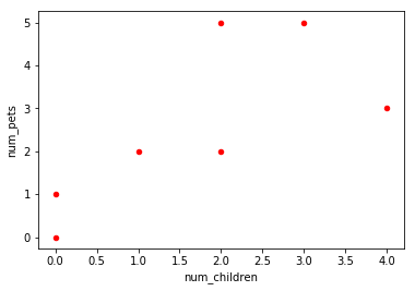
Plot two dataframe columns as a scatter plot
import matplotlib.pyplot as plt
import pandas as pd

# a scatter plot comparing num_children and num_pets
df.plot(kind='scatter',x='num_children',y='num_pets',color='red')
plt.show()
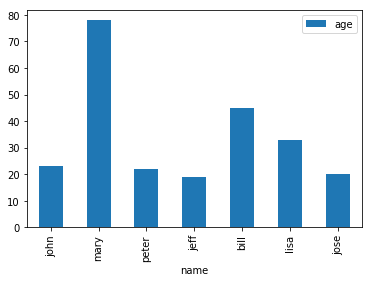
Plot column values as a bar plot
import matplotlib.pyplot as plt
import pandas as pd

# a simple line plot
df.plot(kind='bar',x='name',y='age')
<matplotlib.axes._subplots.AxesSubplot at 0x7f4534eb3780>
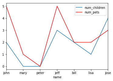
Line plot with multiple columns
import matplotlib.pyplot as plt
import pandas as pd

# gca stands for 'get current axis'
ax = plt.gca()

df.plot(kind='line',x='name',y='num_children',ax=ax)
df.plot(kind='line',x='name',y='num_pets', color='red', ax=ax)

plt.show()
Save plot to file
import matplotlib.pyplot as plt
import pandas as pd

df.plot(kind='bar',x='name',y='age')

# the plot gets saved to 'output.png'
plt.savefig('output.png')

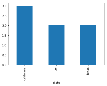
Bar plot with group by
import matplotlib.pyplot as plt
import pandas as pd

df.groupby('state')['name'].nunique().plot(kind='bar')
plt.show()
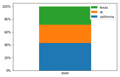
Stacked bar plot with group by, normalized to 100%
import matplotlib.pyplot as plt
import matplotlib.ticker as mtick

# create dummy variable them group by that
# set the legend to false because we'll fix it later
df.assign(
 dummy = 1
).groupby(['dummy','state']).size().groupby(level=0).apply(
    lambda x: 100 * x / x.sum()
).to_frame().unstack().plot(kind='bar',stacked=True,legend=False)

# or it'll show up as 'dummy'
plt.xlabel('state')

# disable ticks in the x axis
plt.xticks([])

# fix the legend or it'll include the dummy variable
current_handles, _ = plt.gca().get_legend_handles_labels()
reversed_handles = reversed(current_handles)
correct_labels = reversed(df['state'].unique())

plt.legend(reversed_handles,correct_labels)

plt.gca().yaxis.set_major_formatter(mtick.PercentFormatter())
plt.show()
References
http://queirozf.com/entries/pandas-dataframe-plot-examples-with-matplotlib-pyplot
Comments